New Year And Christmas Styling For The Time Poor Mum

Christmas and NYE lead up can seem like a combination of PMT, and herding cats, wrangling children, and partners. Shopping and gift wrapping, organising relatives and friends, food menu – who is bringing what. And making sure your “cheapskate uncle” on your husband’s side brings better wine than last year’s $3  bargain basement New Zealand sav blanc.

You’re stressed, the kids are demanding  (what a good idea if school broke up on Dec 24th!). And you feel like you’re at your wits end. Pre Christmas traffic and parking alone can do that.

But that’s what embracing the Christmas period can sometimes be – a headache, and a mass of contradictions at the same time. And the last thing to contemplate on the big day before the celebratory champagne is popped, is the table set for the festive lunch or din dins?

An hour into the elbows up, flaps down and bums up of preparing seafood, ham and turkey you realise.. WTF! I forgot about the table…

Eeeekkkk  you remember, first impressions count on Christmas & New Years.

A few important decisions, remember, can be made ahead of St Nick’s and NYE’s arrival. Like what is the weather going to be like.

This year we are likely to be graced with blue sky’s and mid 20’s temps. So perfect for outside dining if that’s your thing.

The Answer is KISS

So this is my suggestion of a few things to do to make that special table setting, zing. Dressing our Christmas/NYE table is a personal thing. For those of us that require a simple easy route, K.I.S.S [ keep it simple silly]. So if you fall under the KISS category, use what you already have! I know right?

It’s a special time. So pull out Mum and Nanna’s cherished china and silver and use them. The kids and adults as well, love to hear stories of  Christmas past when their parents were kids in the “olden days”.

Vintage Is In

Use old hand-me down family platters if you have them. From my experience, they’re usually a combination of whites, patterns with touches of silver. Try and limit the colour palette so not to create too much visual confusion. White, green and gold are also good alternatives.

Don’t worry that you have mismatching knives and forks. It adds authenticity and looks effortless. And if you are using a mish mash of different platter styles opt for white napery. Find that stray white table cloth in the linen cupboard and give it a good laundering the week before it’s needed. Bleach and or a good soak in Vanish helps banish stains of Christmases past.

The way to make this table zing is to find well-preserved branches of bushes or tree branches to stuff into a couple of plain glass vases.  Magnolia, Christmas bush, hydrangeas, and gardenias. For a long table, 2 vases will suffice.
Keeping with the easy peasy, limited colour palette element, my suggestion is adding some depth using green paper serviettes. It may not be de-rigueur in the age of sustainability, but hey its Christmas. And time is precious!

Three Colours!

Also, you could get younger hands to help and snip off a cut of your branch bunches and tie it to your rolled-up paper serviette with either Jute or leftover Christmas ribbon. The key to successfully dressing the table is sticking to a 3 coloured palette.

A combination of your silverware or other cutlery (definitely not plastic) white table cloth, table greenery, and mismatched crockery, will see your food shine. And your hastily “cobbled together” table will present like on-trend vogue photoshoot. Without the fuss.

Although do remember imagination is the limit here. Be very aware of not overcrowding the table. There has to be plenty of room for the goodies to be passed and shared around.

If you want a more formal Christmas or New Years table setting, upgrade to a nice table cloth if you have one – it’s an occasion. You don’t, like, go to a ball in your tracky dacks!

Use the family’s best china and silverware. Doesn’t matter, again, if the settings are cobbled together from family members. It’s a celebration. So treat it as such.

To add some swankiness to the day (and why not), add handwritten place name cards. It makes your guest feel oh so spesh! And guarantees, possibly, a much better Chrissy present for you next year! Weeeeee!

I may sound like a broken record, but again limit your colour palette. Stick to 3 colours and that’s it!  Anymore looks naf. And think about the colours of our Australian nature .  Think softer greens,  blush pinks to emulate the gum blossoms. There are tonnes of gum blossoms out now so you can literally forage them for the side of the road!

I’m sorry guys, but, the “Euro” Christmas colour path we have gone down for so many years, needs an Aussie rethink.   And it is time for a change – our own identity, rather than an adopted one.

A great trick to give a formal setting more depth and interest, is to think about creating levels. It may seem weird, but trust me. Wrap a stack of books in either white butcher’s paper or old white linen serviettes, to stand your key serving platters on. It helps the turkey, ham or seafood stand out among the veggie platters and other yummy confections being served.

You Can Never Have Too Many Candles

Oh and always add candles, and I mean plural. Use as many as you feel comfortable with . Candles always deliver the quintessential Christmas feel without the big bucks. And to keep with the formal look use the same size candle. Tea lights in the small glass containers from Ikea are a good option for creating ambiance and not a table fire hazard.

Think mass groupings of candles, like mass formal garden plantings to help create the most stunning table out there . And keeping with the greenery vibe, if you see potted succulents or a Kmart equivalent  buy three of them. Set in a line down the table is neat and yet adds more “je ne sais quoi”.

And my last few personal tips for you on the day.

1: Breathe deeply. There WILL be food and wine accidents –  adults usually are to blame. As they say in Frozen .. “ let it go…” life’s way too short.

2: Relax and enjoy . And to paraphrase, Monty Python, don’t mention the war. So avoid politics and religion as conversation topics and everything will go swimmingly! Except of course if the only thing to drink is cheap sav blanc.


This post originally appears in Mouth of Mums
2020 interior design trends: Five to watch!

This post originally appears on Interiors Addict.

Throughout her work as a Sydney-based interior designer, property stylist and media presenter, Jane Thomson is exposed to more trends than most. And after 30 years in the business, she has an intimate perspective on the Aussie interior design scene.

“Australians are far more selective than we give ourselves credit for. We don’t just slavishly follow the latest overseas design trends and I don’t see this as a bad thing at all. Ultimately, Australians love a style that will stand the test of time,” says Jane who shares her top five interior design trends to watch out for in 2020.

1. Personal expression: Repurposing and sustainability

This 2020 prediction is a favourite of mine and it’s driven by our universal need for sustainability. How many times have we seen furniture sitting forlornly on the roadside edge waiting for the council clean up?

The question is; ‘Could it be repurposed?’ Possibly. Buying an item brand new is cheaper and easier (and keeps the Harvey Norman or Freedom furniture cash registers ticking over) but think of those weekends, and time wasted trudging through retail establishments to find a piece that resonates.

A repurposed hutch from an old 1970’s brown behemoth Jane designed for her on-screen client on Channel 10’s Changing Rooms Australia

Repurposing in my book is pretty simple. Repurposing an old piece of furniture is not only sustainable, but allows us as individuals to make a statement about ourselves. It saves money and resources but it does take time, and requires some imagination. At home you may have a piece that can be refurbed and you can really personalise the piece. Gumtree is a goldmine for old pieces just screaming to be repurposed.

To ‘zhoosh’ a discarded piece of furniture is an opportunity for you to say something about how you feel. Take an old battered timber buffet for example – a lick of paint, sand, apply some milk paint/lime wash, some new sexy handles and hey presto! Here’s your new bespoke designer item! Curate your new piece with your favourite piece of artwork and you will have a personalised and sustainable space that screams ‘you’!

2. Eclecticism

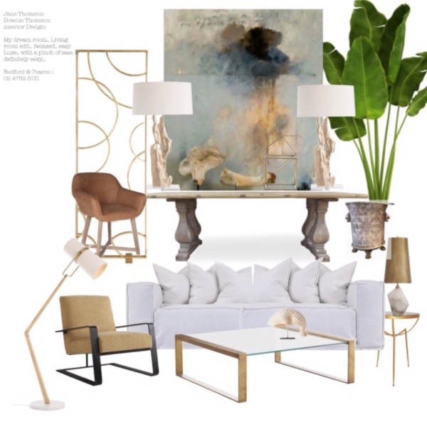
Incorporating a mish mash of different design styles isn’t new, but sadly it has gone to the Gods over the last few years. For 2020, I do hope this design style takes off. Eclectic interiors are far more interesting, and just like the previous trend, allow you to speak about yourself through your living space.

Eclecticism explored through a mood board by Jane

3. Wall paneling

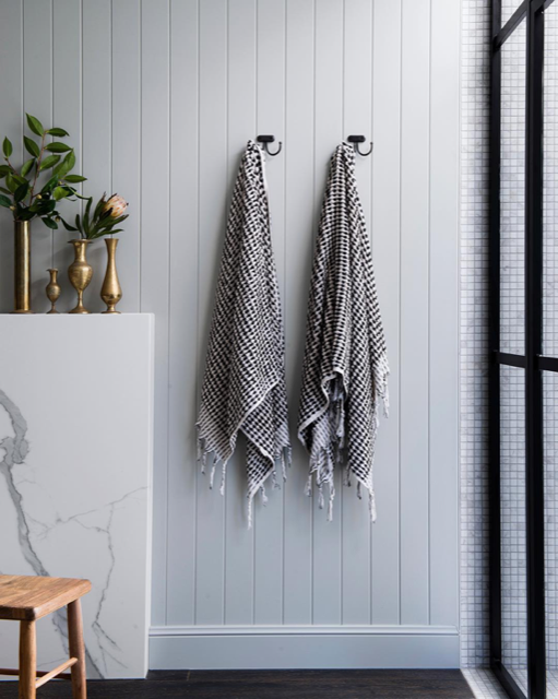
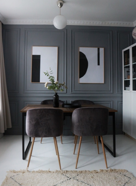
This fabulous trend is something of a time-honoured tradition (Interiors Addict has been espousing its virtues for some time!), after all it has been around a while. I am hoping this is a trend that people will really run with in 2020. Paneling is a relatively inexpensive way of imparting architectural detail and depth to a space. There are a plethora of materials and styles out there. Whether it’s 1920’s style battening (love!) to a coastal feel using V joint paneling (available inexpensively through well-known hardware suppliers), it delivers a million dollar feel.

Wall paneling. Image source: Pinterest

In addition to this, with so many new apartment builds, and many people having to turn to apartment living, developers don’t have the budgets to create inspiring interiors. Paneling over white uninspiring plaster board brings greater architectural merit to the space for little outlay.

Image source: Pinterest

If you feel like a more elegant vibe take a look at bolection moulding. Its origins are French (Parisian actually) and the trend has been around for a while. It takes a little more time to design, but the results will make you smile. It really is a classic look that’ll stand the test of time.

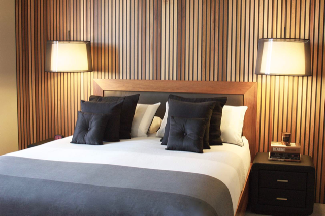
Timber slat paneling. Image: Yvette Kapadia

4. Curves

For years we seem to have forgotten curves but nature doesn’t have many straight lines or angles, so it is refreshing to see the return of something that resonates with everyone.

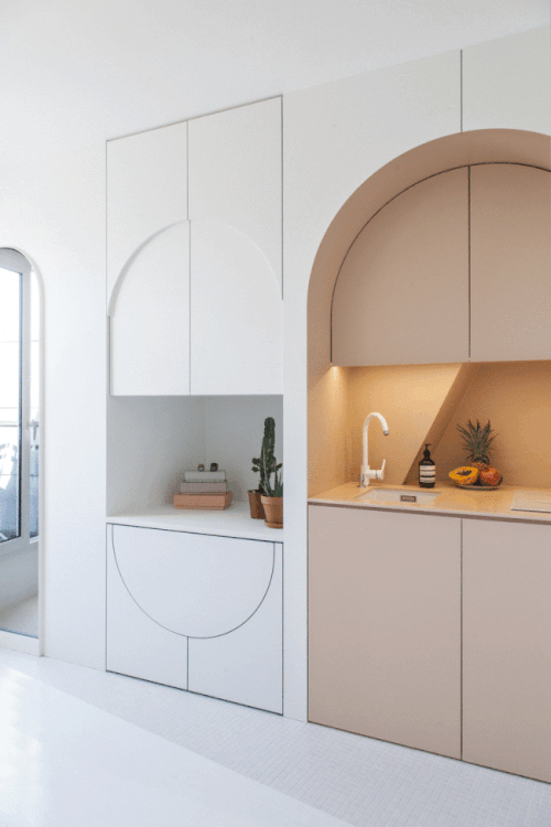
Image source: Pinterest

The curves that we find in spaces such as hallways (archways) now pay homage to curves past, but in a cleaner less obvious way. Lines can be sharp, but the design integrates rather than shouting ‘Look at me, I’m a curve!’

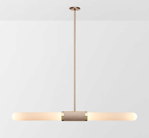
I love this lighting company and their designer, Australian Articolo designer Nicci Green. I want one!

5. Large scale art = YAY!!

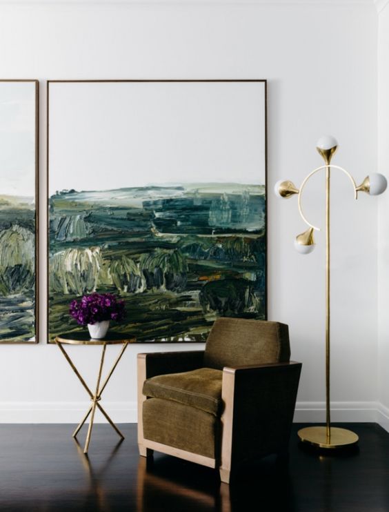
This is a 2020 design trend prediction that is close to my heart. My design idiom has always been ‘go big or go home.” Never have I been an art exponent of the small and piddling, unless of course it’s a Drysdale or Nolan! Large art ALWAYS works, no matter the size of the space. Teeny tiny rooms sing with a large-scale artwork. It acts more like a mural and can almost be a window to another imaginary world. Repeat with me: ‘Go big or go home.’

Image source: Pinterest


Am I weird or am I weird… Nature or Nurture?

People ask me often …Why the hell are you an interior designer?

It’s a really good question.
I have this unnatural- some would say connection / fascination with space and the immediate environment. It speaks to me, or in my case, yells at me. I thought for a very long time I was a weirdo.

Design for me, is a constructed language, luckily for me one that developed naturally. And I’ve found, there are few people who speak it well.

My name is Jane Thomson, I’m a Sydney based interior designer (you have guessed that!). And I simply adore what I do.

Space has always confronted, challenged and delighted me. The impact a space, its experience, and how it impinges on people is truly earth shattering. It is that wow or whoa!!!!.. moment, when you walk into an environment.

I don’t know why I have this “innate” attraction, but the connection with space and its environs had for me, a very early childhood connection. The joyfulness and warmth of the right space can still overwhelm me – as a child it could bring me to tears.

My father, whom I adore, is an Architect, my mother was also an interior designer. So this apple hasn’t fallen far from this tree.

My siblings and I, whom were very lucky kids, grew up in some simply awesomely designed spaces, designed and curated by dad and mum.

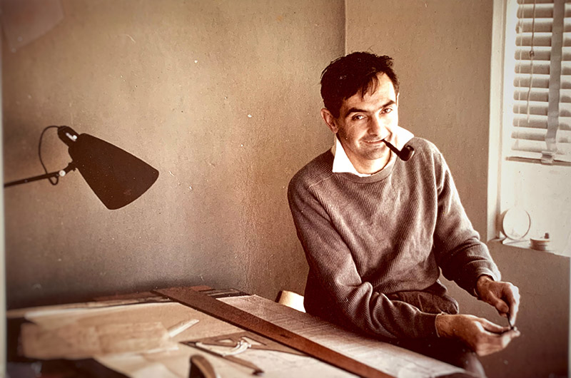
My fabulous Dad, Architect Len Downie image circa 1963

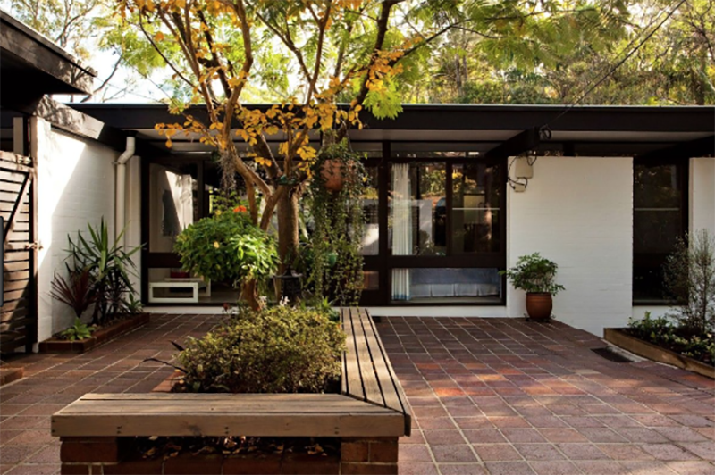
Dad designed our first home. A beautiful “mid-century” 1960’s bungalow [channelling Pettit & Sevitt] on the north shore of Sydney. It was a beautiful single-story testament to thoughtful living. Far cry from the 1950’s inspired tile and brick boxes springing up elsewhere in Sydney suburbs.

Our place was in essence a “white out” White washed boncrete brick walls inside and out, with the exception of creosote stained window, beams and door sections, white wool shag pile carpet( very yeah baby!) with quarry tiles and timber stairs down to the living spaces. The only splash of colour that deigned to enter our home was this fabulous 1950’s 6 seater couch, which is still going strong. (take that Ikea!)

Mum cleverly covered it in this stunning peacock green “tweed” in linen and wool.. This bad boy just popped in the space. A huge white coffee table was the room’s centrepiece. And Mum, the design doyenne, a frustrated artist, bringing judiciously adorned it with beautifully carved timber trays and bits and bobs. Sounds pretty on trend now doesn’t it?

An enormous floor to ceiling fireplace [yes …you guessed it a white washed brick number] ni width approximately 3000 metres wide, with a built in cantilevered timber “seat” dividing our living and dining room with generous Walkways either side. French doors to both rooms opening out on to a stunning north facing courtyard, complemented Dad’s design.

Dad’s cutting edge design gifted our house with “great bones” & “less was more” .  Mum was a natural when it came to interiors.  Bedrooms were understated.

Bathrooms were a mix of glass mosaic tiles in Peacock green white and metallic bronze. Totally timeless and which still stand the test of time today. Dad designed simple, bespoke complimentary vanities.

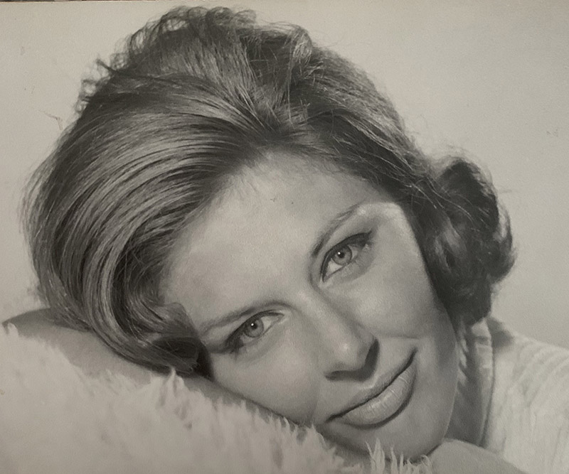
My incredibly talented and beautiful mum interior designer Liz Downie

From the front to the back door our house was a considered by the neighbourhood a stunning collaboration curated by mum and dad. It was a stark contrast to our neighbourhood.

It was in my opinion worthy of design awards for a suburban home, compared to some of my friend’s domiciles. Which were an assault on my young sensibilities. Ugly bugly café curtains hung haphazardly above kitchen sinks. Chaotic bric a brac strewn willy nilly throughout these poor kids’ homes. Chenille bedspreads, I knew at a young age were just wrong!

So you can understand my thought that I may have been a weirdo!

So the kicker is…travelling with my parents in the back of Dad’s baby poo coloured Peugeot (no Holdens or Ford in our family),  I found as a kid, the trip to Bankstown to visit my grandparents as depressing It was such a stark contrast to the trees and bush of our leafy green and “waspish” suburb.