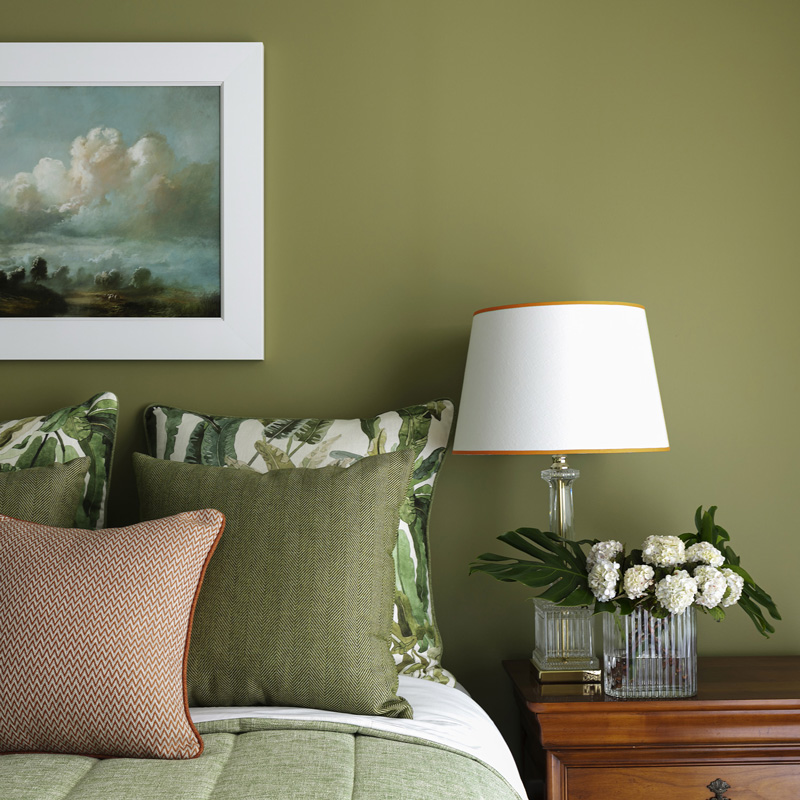
Now this lovely image is certainly not a design Crime! in fact it’s been designed and styled by little old me…
DESIGN CRIMES
Yes they exist. You know they do. And you may be the quintessential “serial space killer.”
Id go as far to say some are even worthy of a jail stint
Oh, the visual pollution, the feeling of unease, the wrinkles that are now engrained on your brow from frowning… foreva.
Upon spying offending interiors, you know you don’t like the feeling, there’s a palpable unease, and you know there’s something seriously wrong but can’t quite put you finger on it. You know right away, and recoil in disgust! Seriously gurl???
You’ve seen a plethora of them but some aren’t as obvious as you’d think
Below are 5 serious design crimes you soooo don’t want to commit!
1. Cushion crimes:
Okay not wishing to be mean but.. I need to be. [ Yes in know there are children starving in Africa.. but… ]
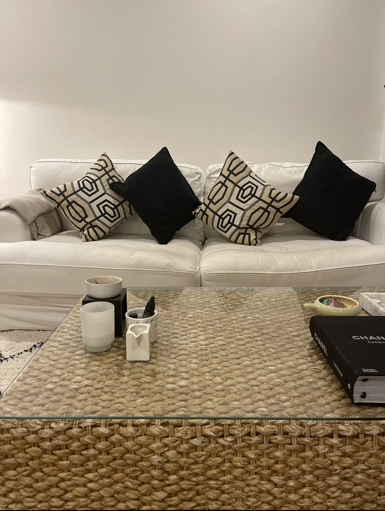
A lot of us well meaning design lovers just don’t have that “je ne sais quoi” .. or natural ability to “just know” , so our well meaning attempts to give some well needed love & styling to our spaces has failed dismally…
Please NEVA EVA create an abomination like this..
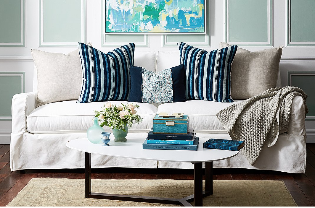
When you can create a delicious cushion confection like this…
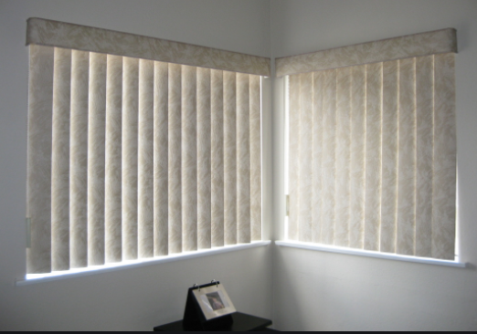
2.VERTICAL BLIND CRIMES
“What?” I hear you say? “Really? But they’re so practical!! And cheap !”
“Ummmmmm” I say . Sure they’re cheap, and look cheap. As For your practical comment! “No theyre not!!!!”
Theyre ugly, stupid, impractical and were born out of Satan’s bottom. They can on occasions strangle small children, always look undity and to be blunt.. Criminal.
There are a million other window treatment options that are simply gorgeous compared to this vile scourge that are VERTICAL BLINDS .. even a bedroom sheet would look better tacked onto the architrave!
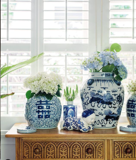
Shutters , sheers , venetian blinds , plain roller blinds [ equally as cheap as verticals.. ] Roman blinds , matchstick blinds [ making a comeback BTW ] are some stunning options people!
Please explain to me how these actually look great??? I cant deal!
Why not a beautiful pair of Stylish shutters? These Days the pricing is possibly only a quarter of what they were in times gone by.. a great PRACTICAL and cost effective solution.. AND they’re beautiful..
3. HANGING ART TOO HIGH, CRIMES ..
A very common design crime. And one that’s annoyingly committed by most.
It is a practice that is the bane of my life!
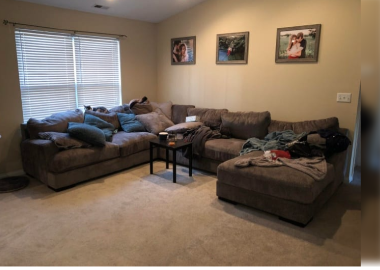
Hanging art too high looks .. well lets face it ” Bogun” or for you Americans or Canadians “Red neck” or for people in the UK.. “Chav” .. This Design Crime is simply awful and can ruin a room and a beautiful vibe.
Ive had the occasion to visit clients and their art has been hanging almost to the line of the cornice . Upon asking them ” Do you like you art up so high” Their response was that they “…thought that people needed to stand back to appreciate art , so they thought the closer to the ceiling the better the viewer could take in the art”.. mmmmmmm
News flash!! it looks awful and doesn’t bode well for the ambiance of the room …
This is how NOT to hang your precious pieces ..
Hanging art at a lower level not only makes sense of the wall but it feels good and relates to the furniture around the piece
Here’s a recent project of mine including a large format art..
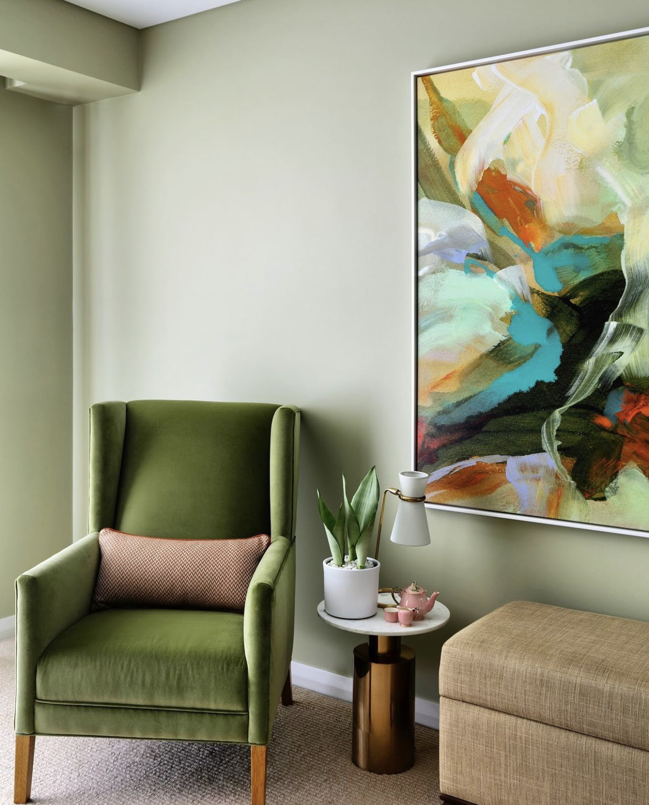
So as you can see the art isn’t sitting up near the cornice.. It’s much lower and looks divine
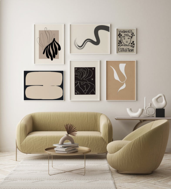
So here’s another “well hung art image” to inspire you .! Lower down the wall and lookin’ so fine..
4. LIGHTING CRIMES
Lighting, one of the most important of the design elements. Bad lighting can turn a stunningly curated space into a Crime Scene.
A couple of tips
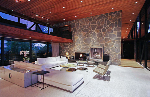
- Don’t install copious amounts of recessed lighting [ down lights ] The area ends up looking like a landing runway for aircraft so , please don’t overdo the fixed lighting. You don’t need it and spaces look overlit . So theres no real ambience going on.. I mean do you really want to see your beloveds crows feet?
- Do place your fixed recessed lighting where you actually need it.. so near artworks you want to highlight or to highlight over a seating area. You rarely ever need more than one.. for a small area.
- Do use table lamps & floor lamps to create a soft ambience, and I guarantee you everyone will look just gorgeous [ no crows feet] and your power bill will thank you.
Here’s how NOT to add downlights
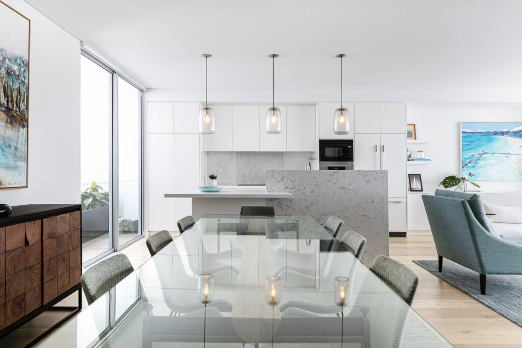
Here’s a recent project of mine showing minimal downlights or recessed lights usage . Actually there were only 2 lights near the Dining room and Kitchen given that I had specified enough ambient floor lamps and table lamps.
ANOTHER IMPORTANT TIP:
If you’re embarking on a renovation, PLEASE keep a short leash on your well meaning electrician? They’re trained to spread light to the world! So they will want to pepper your ceiling with copious amounts of downlights.. Don’t let them
Your fifth and final design crime , for now.. [ trust me there are thousands of them]
5. Rug Meanies .. They exist.
Using rugs that are too small for the room [ Its a criminal offence]
There is only one rule : Don’t use small rugs.
If you have a limited budget, go for a cotton or jute rug but….
MAKE SURE, SAID RUG IS BIGGER THAN THE FOOTPRINT OF THE SPACE YOUR DECORATING?
Yeah I know I’m shouting [ sorry, passionate.. ] but youre wasting money on a teeny tiny rug when you could wow yourself everyday by using a larger piece .
See an offence below..
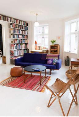
Seeeeee? .. it looks mean and does nothing to support the rest of this lovely room.
Do not stop and go straight to Jail!
Meanwhile..on the outside ..
This is sooo purdy..
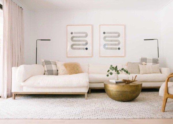
This is how you do it! Make sure that the rug is larger than the footprint of the furniture.. you’ll want be able to fit your sofa and a coffee table on the rug. The vibe is generous and beautiful.
So avid DIY’ers, with this timely information, you’ll hopefully never commit a design crime again!!
NEWSFLASH!
Im super excited to announce my new BUY NOW PAY LATER service!

So if you’d like to start your new project and need time paying you can now pay via BRIGHTE up to $60,000 over a 5 year period!
This includes
- FEES
- FURNITURE
- LIGHTING
- Basically anything pertaining to my services!
Or for smaller services up to $1200 you can get almost instant access to this wonderful service via my website!
So now you can easily embark on your next project with complete confidence!
Do you need a hand?
If you’re considering a new project in 2021, no matter how small or large, and don’t know where to start ?
Lets chat about all of the stunning possibilities!
Book your free 15 minute Discovery Call, I’d love to chat to you!
