Darlinghurst
I’ve previously completed 4 renovations for the owners of this cutting edge apartment in Darlinghurst. My wonderful clients had previously leased this spacious 3 bedroom apartment out for near 8 years. Sporting breath taking 270 degree views over Sydney harbour.
Feeling that they’d love to move in and have a city pad, it needed emergency design “E.R”!
Having worked with me for over 20 years, my wonderful clients were pretty much open to anything! I believed the interior should just sit back and relax and let the view do most of the magic, as with any good film, there can only be one hero!..
So, for this project I suggested a pared back, simple approach. Let the view shine and the interiors should compliment. I guess some designers would have embraced the blue of the harbor waters or the green attempting to capture the foliage. Believe me it was tempting to go the usual route!
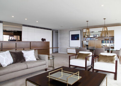
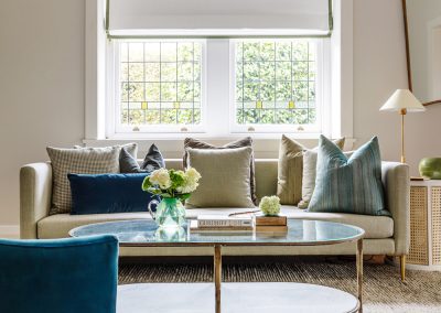
A very neutral palette with a grey green base really resonated especially for the furniture and fittings to the living and dining area.
My clients loved the idea.
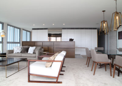
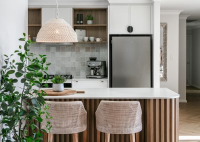
The kitchen was replaced, but I felt the existing footprint worked exceptionally well. So I retained the basic floorplan.
The existing kitchen, whilst cutting edge design around 15 years ago was now tired and dark.
Balancing this out with white joinery seemed the perfect foil. It worked.
To give some understated detail, I designed a bespoke look with a simple flowing pattern that the joiner routed out to created a series of battens that ran in patterns across the joinery doors. Essentially I was paying homage to the hundreds of Deco buildings that are littered across the wide Sydney harbor vista. It gave the battening a modern, funky twist.
Using DULUX Natural white as our Joinery colour to the North Facing view it just worked a treat.
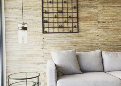
The western wall to the living dining i was wallpapered in a white, natural and soft taupe, Grass wallpaper. This imparted beautiful texture to the wall that beautifully complimented the outstandingly beautiful view. Kind of bringing nature in without being too contrived.
To work along side the natural colour palette I felt the carpet should be soft and unctuous. So I went with a dirty soft grey green colour..Giving great feel, underfoot when ambling around bare foot was absolutely essential
For the first time ever I specified a solution dyed Nylon carpet! OMG!
However, it just fit the bill perfectly!
[Alert! Many Nylon carpets just DON’T look as wonderful. You really do need to throw some money at it to get the best quality nylon carpet]
Almost indestructible and incredibly silky soft, this carpet could withstand my couples 2 doggies and a couple of toddler grandchildren.. massive tick for the Nylon carpet!
To nail the feel of a city skyline I used metal pendants with an architectural bent. Utilising mid-century style chairs and a stunning bronze based, glassed topped dining table, for some good reflection. Being Sydney we’re always in the midst of construction somewhere on the Skyline.. adding the metal accents was a testament to the ever increasing skyline.. I see this as exciting rather than negative.. It allowed me to impart an urban feel to the space. In all I felt so incredibly privileged to have completed this fabulous project.. if youd like to chat to me about an upcoming project please feel free to email me @ jane@dtinteriors.com.au
Related Projects
Interested in Working Together?
Jane Thomson is available for projects in Sydney and most of Australia.
