Secret Squirrel Design Tips

I so hope that May was kind to you and life is peachy? June in Australia is traditionally a time whereby we’re indoors more.. Escaping the wet wild and woolly days that do remind us that we do in fact experience some cold in this wonderful country of ours.

So, if you’re hibernating in your space and thinking of tackling some DIY design/ decoration/styling at home, below are some sexy tips that may help you avoid making tragic and expensive mistakes!

Dont let this be you after making serious DIY design gafs.

1. 60/30/10 rule

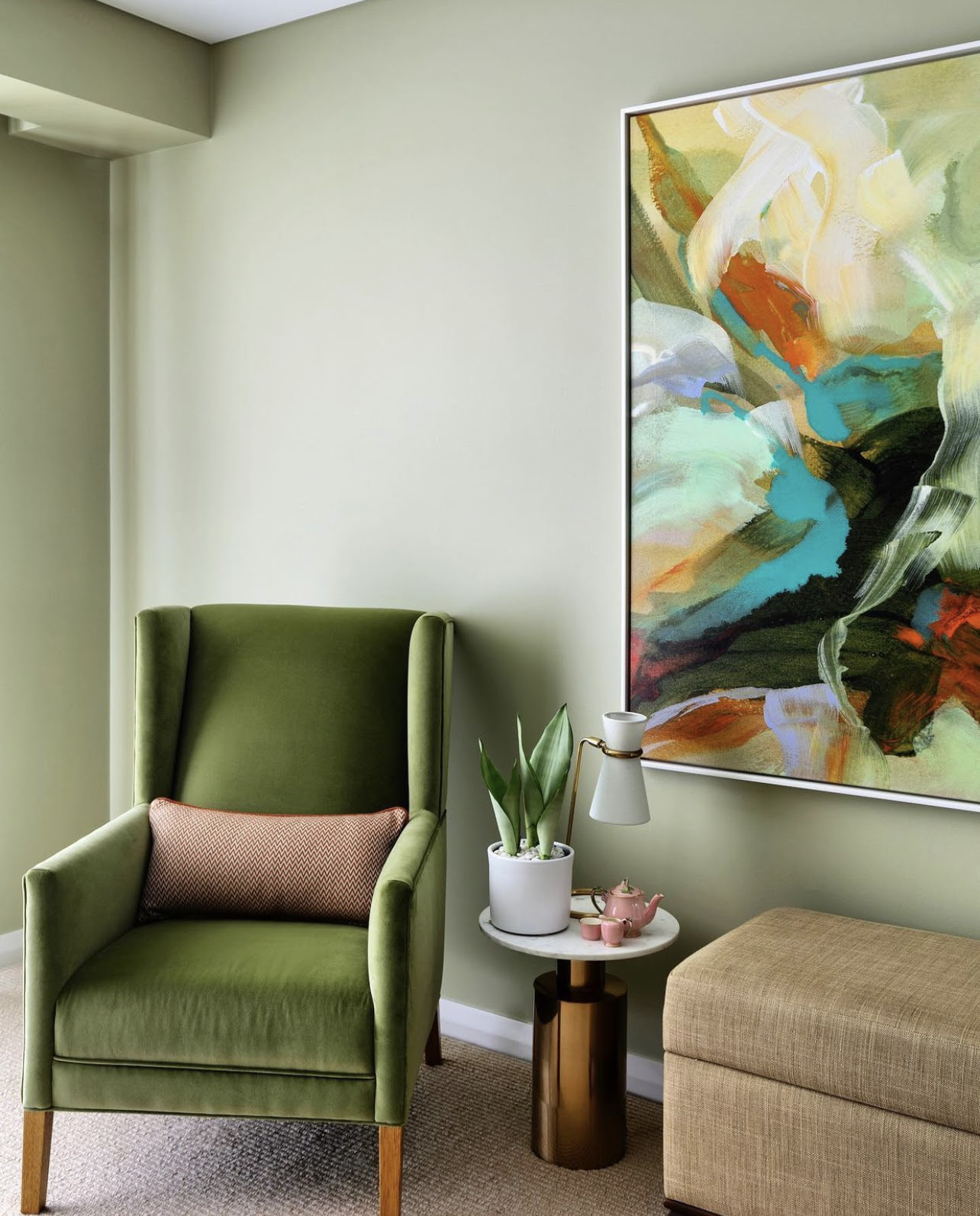
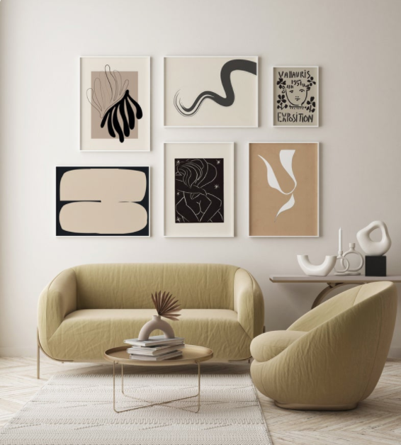
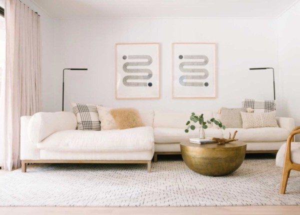
This one is an oldie but a goody. With this clever rule you really shouldn’t go wrong.. fingers crossed! 60% of the scheme should be the dominant colour . Generally it’s the wall colour or wallpaper or significant hero pieces say a sofa. Say the dominant colour is White.

The 30% percentage will be your secondary colour, that works like a treat with the dominant colour. Say this colour is black .. this could be picture frames your accent chairs , cushions ..

And 10% will be your accent colour. This one can be the fun one! And this one can be say .. Brass .. vases the legs to your accent chairs..

This is a simple and effective rule so you won’t make any big nasty boo boos, keep your marriage and not send you broke.
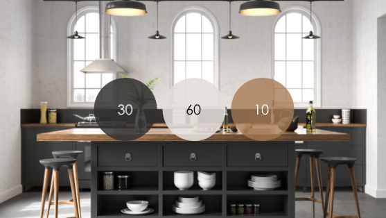
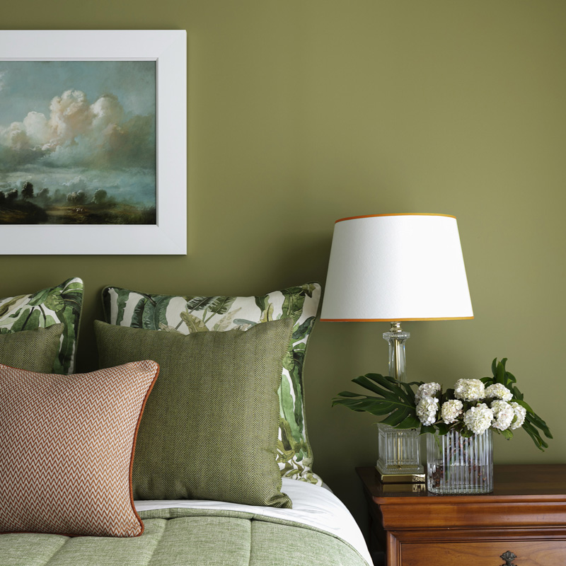
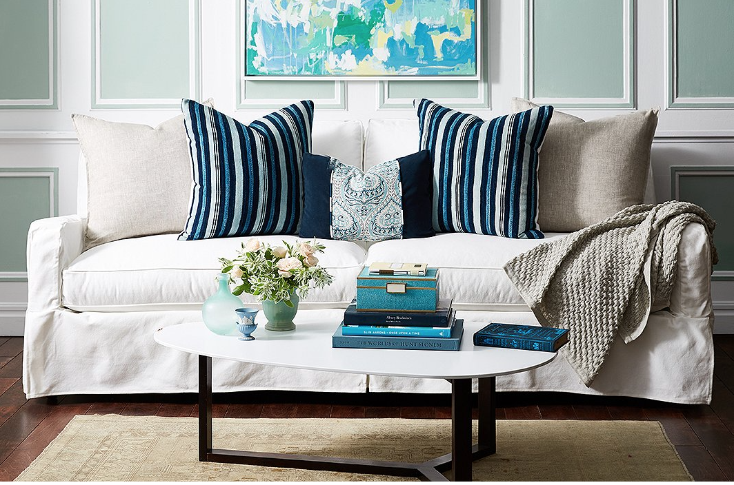
A great example of the 60/30/10 rule, sexy isn’t it?


2. Go big or go home

This one can be open to misinterpretation.. so let me make this clear for you?
You will most definitely create a more magazine worthy space if you use items with not only a good scale, but items that are larger rather than smaller.

Generous proportions make for pleasing visuals. Small items peppered around willy nilly, NEVER LOOK GOOD. I always use this example re so many design themes. So pardon me if you’ve heard me utter this before.

Have you noticed that rooms full of piddly little items never make it to the cover of BELLE or VOGUE or HOME BEAUTIFUL? Rooms full of piddly little items never even make it to the middle or the back of any decent magazine.

You know why? Cos, piddly cluttered rooms look naf.
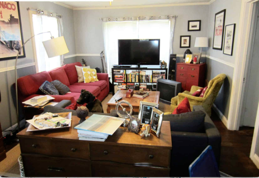
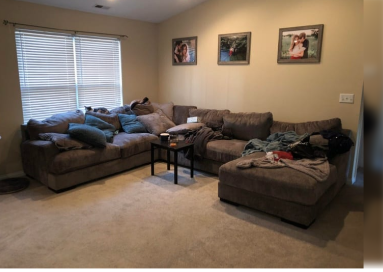
Ok, ok, I know this is a cluttered room, but look at all the small items.. Even the dog looks spooked, errr….can you actually see the dog?

Multiple small items, confuse the eye, they overwhelm people, and create anxiety.

So the solution is invest in beautifully curated, larger pieces that mean something to you. They don’t have to cost a king’s ransom.

Look for accessories that relate to the scale of your existing pieces and the ceiling heights.. . If you have eclectic tastes, even better! Try to stay in the same realm? You can most certainly mix colours even with the 60/30/10 rule.. the 10% part can be a mix of a couple of colours.

The “Go Big or Go Home” idiom also relates to rugs, sofas, coffee tables.. Its always better to go a little over sized than undersized.

Rugs, that are too small for the space look horrendous! The onlooker will see the space as mean, and also you!

Generously proportioned interiors are positive! Make you look like the generous awesome human that you are! Or would like to be!
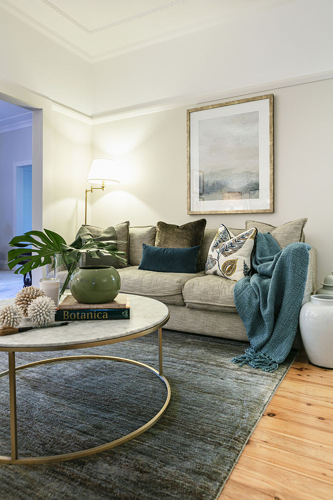
Ahhh thats better. Larger items and less of them. Noice? Design and Styling : Jane Thomson : Image : Yie Sandison


3. Styling in odd numbers ..

When styling your space.. even numbers look OK. Where as odd numbers look “kick ass”

There are few occasions whereby I’ve spied a stunning “even numbered” styling vignette. [ Don’t you love that word “vignette”?]
They are, as mentioned before. OK. But not interesting. And don’t we all want to be interesting?

Styling in 3’s – 5’s – 7’s – 9’s .. [you get where I’m going] creates enormous interest and complexity. Then the other tip is DON’T STYLE IN A LINE. Lining up items of different sizes looks terrible. See below mantle aberration. EEK.
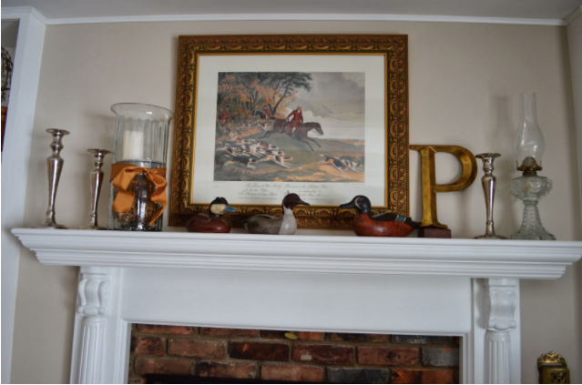
Too much stuff and badly arranged

Better to use less or style in a triangular fashion ..
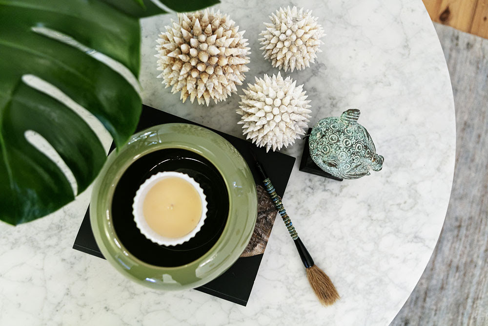
Grouping items and making sense of them , well just makes sense and looks brilliant, even if I do say so myself
Design and Styling : Jane Thomson : Image : Yie Sandison

I so hope that this will help you with your DIY designs! So go forward and style with abandon
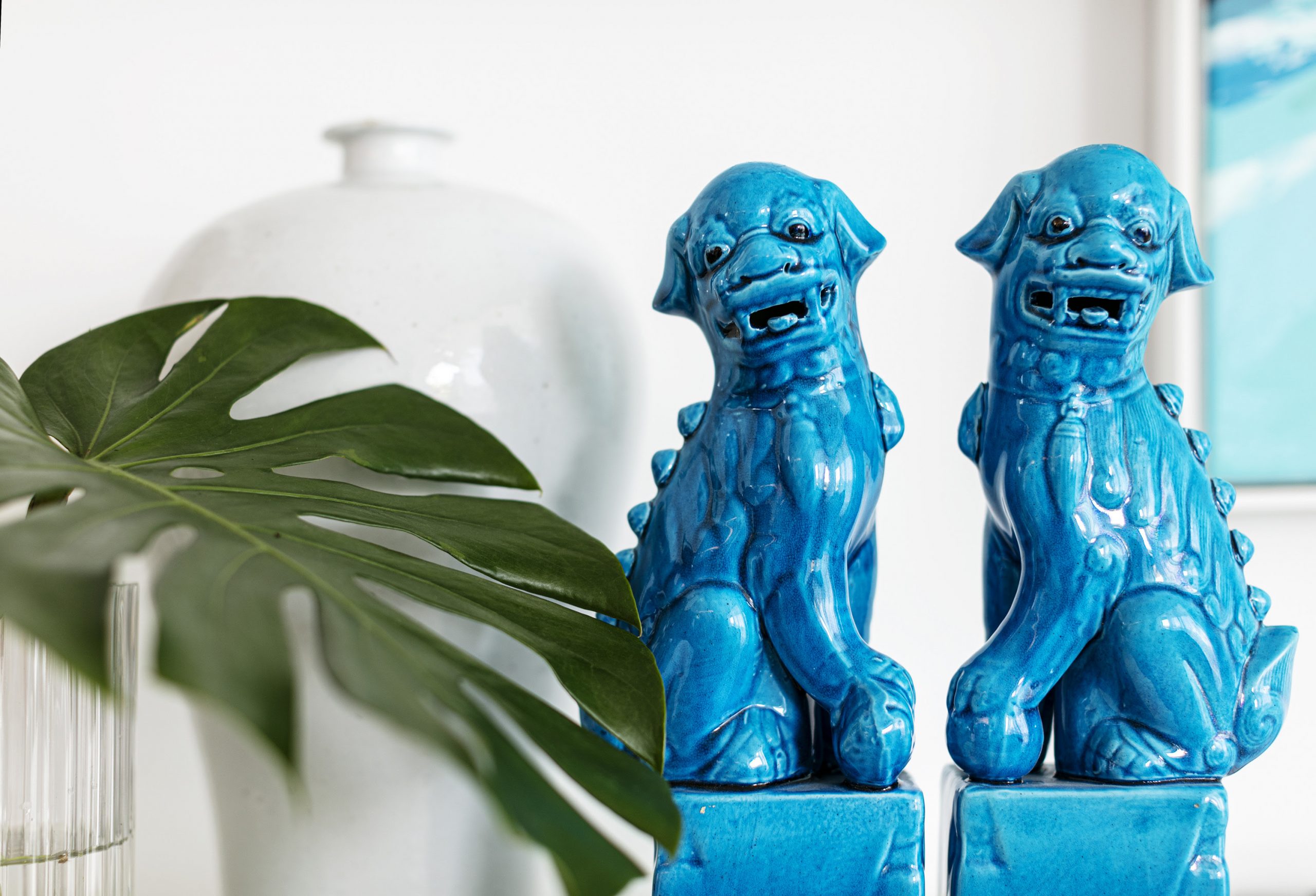
Design trends for 2020 – 2021!

Whats what, in design trends for 2020 – 2021

Australians are far more selective than we give ourselves credit for. We don’t just slavishly follow the latest overseas design trends and I don’t see this as a bad thing at all.

Ultimately, Australians love a style that will stand the test of time. Sure, this is mainly because we pay twice the amount for the same product than in the USA but we also love a design that speaks true to our lifestyle and personality. We are willing to spend more on design if we can see the value in it .

So, here are some exciting 2020 design eye candy that I feel have legs over the next year and beyond!…..

READ THE REST OF MY ARTICLE IN …..”HOME BEAUTIFUL” magazine

Dumping the dark and dingy

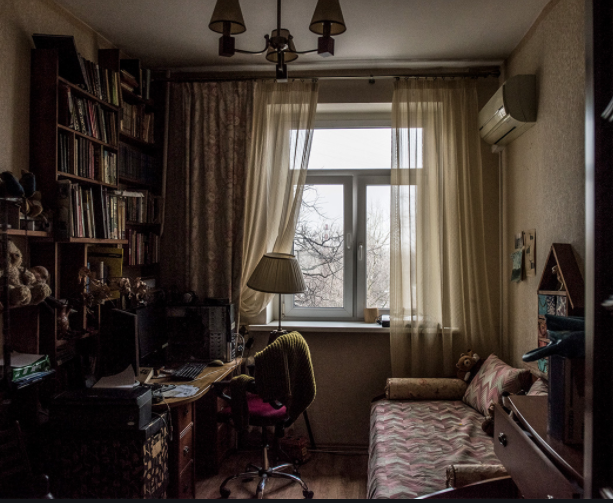
Are you existing in a dark and dingy interior?

Have you ever thought how these depressing interiors can affect your mental health?

Here’s some great tips to help you dump the dark and dingy and embrace a fresh new look.


Now, honestly how does the image above make you feel?

Are you encouraged to enter this space?

Ten out of ten people I canvased recoiled in horror! And YOU will be horrified at how many people exist in these dingy, dull and lacklustre spaces. And the inhabitants that do, cant figure why they felt so down and depressed. They’ve lived on these spaces for so long they’ve forgotten to reassess the space.

Environment is EVERYTHING!

Here are some quick tips to make your space feel less like a jail and more like a beautiful sanctuary that you SHOULD be living in.

  • Decluttering. and reassessing… for any space really, but especially the dark and dingy.
  • Let the light in! The nightmare space above for instance : removing those “stale cheese” coloured sheers and heavy drapes would do wonders for this space straight up. Install shutters in a warm white or if budget is an issue some beautiful ready made linen sheers!
  • Paint it out: If you take on this job yourself, painting is an inexpensive and easy way to spruce up any scary space! Discover your go to colour that puts a smile on your dial. And suits a small space. Heads up, Dark colours DO work in small spaces as long as you have contrast!
  • Don’t overcrowd a small space. Overcrowded small spaces, full of stuff, yell hoarder and creates a feeling of introspection and sometimes anxiety..!

I could go on forever about the negativity of dingy rooms!

If you need some help with your space and would like to have a chat, about your space?

Book your FREE DISCOVERY CALL today!

Yours in design,

Design Crimes

Now this lovely image is certainly not a design Crime! in fact it’s been designed and styled by little old me…

DESIGN CRIMES

Yes they exist. You know they do. And you may be the quintessential “serial space killer.”

Id go as far to say some are even worthy of a jail stint
Oh, the visual pollution, the feeling of unease, the wrinkles that are now engrained on your brow from frowning… foreva.

Upon spying offending interiors, you know you don’t like the feeling, there’s a palpable unease, and you know there’s something seriously wrong but can’t quite put you finger on it. You know right away, and recoil in disgust! Seriously gurl???

You’ve seen a plethora of them but some aren’t as obvious as you’d think

Below are 5 serious design crimes you soooo don’t want to commit!

1. Cushion crimes:

Okay not wishing to be mean but.. I need to be. [ Yes in know there are children starving in Africa.. but… ]
A lot of us well meaning design lovers just don’t have that “je ne sais quoi” .. or natural ability to “just know” , so our well meaning attempts to give some well needed love & styling to our spaces has failed dismally…

Please NEVA EVA create an abomination like this..

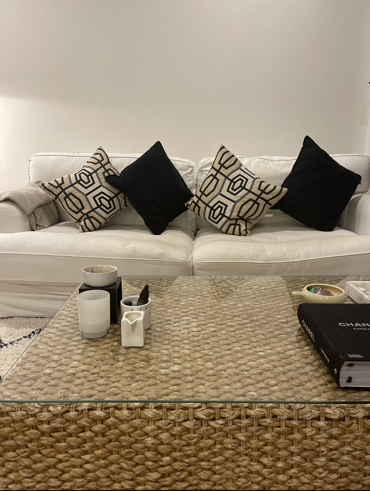
Cushions placed on the diagonal.. I don’t get it. I don’t like it. It just looks weird. What do you think?

When you can create a delicious cushion confection like this…

Just bootifullllllll …

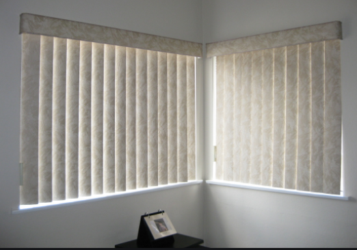
2.VERTICAL BLIND CRIMES

“What?” I hear you say? “Really? But they’re so practical!! And cheap !”

“Ummmmmm” I say . Sure they’re cheap, and look cheap. As For your practical comment! “No theyre not!!!!”

Theyre ugly, stupid, impractical and were born out of Satan’s bottom. They can on occasions strangle small children, always look undity and to be blunt.. Criminal.

There are a million other window treatment options that are simply gorgeous compared to this vile scourge that are VERTICAL BLINDS .. even a bedroom sheet would look better tacked onto the architrave!
Shutters , sheers , venetian blinds , plain roller blinds [ equally as cheap as verticals.. ] Roman blinds , matchstick blinds [ making a comeback BTW ] are some stunning options people!

Please explain to me how these actually look great??? I cant deal!

The Vertical Blind, one of the worst examples of severe visual pollution! A major Design Crime!

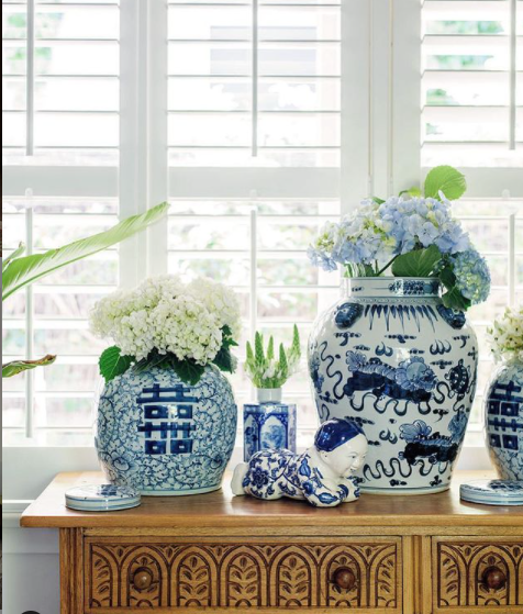
Why not a beautiful pair of Stylish shutters? These Days the pricing is possibly only a quarter of what they were in times gone by.. a great PRACTICAL and cost effective solution.. AND they’re beautiful..

Ahhh such visual eye candy.. Love ….

3. HANGING ART TOO HIGH, CRIMES ..

A very common design crime. And one that’s annoyingly committed by most.
It is a practice that is the bane of my life!

Hanging art too high looks .. well lets face it ” Bogun” or for you Americans or Canadians “Red neck” or for people in the UK.. “Chav” .. This Design Crime is simply awful and can ruin a room and a beautiful vibe.

Ive had the occasion to visit clients and their art has been hanging almost to the line of the cornice . Upon asking them ” Do you like you art up so high” Their response was that they “…thought that people needed to stand back to appreciate art , so they thought the closer to the ceiling the better the viewer could take in the art”.. mmmmmmm

News flash!! it looks awful and doesn’t bode well for the ambiance of the room …

This is how NOT to hang your precious pieces ..

Hanging art at a lower level not only makes sense of the wall but it feels good and relates to the furniture around the piece

Here’s a recent project of mine including a large format art..

No low hanging art around here!!

So as you can see the art isn’t sitting up near the cornice.. It’s much lower and looks divine

So here’s another “well hung art image” to inspire you .! Lower down the wall and lookin’ so fine..

4. LIGHTING CRIMES

Lighting, one of the most important of the design elements. Bad lighting can turn a stunningly curated space into a Crime Scene.

A couple of tips

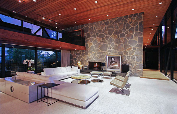
  • Don’t install copious amounts of recessed lighting [ down lights ] The area ends up looking like a landing runway for aircraft so , please don’t overdo the fixed lighting. You don’t need it and spaces look overlit . So theres no real ambience going on.. I mean do you really want to see your beloveds crows feet?
  • Do place your fixed recessed lighting where you actually need it.. so near artworks you want to highlight or to highlight over a seating area. You rarely ever need more than one.. for a small area.
  • Do use table lamps & floor lamps to create a soft ambience, and I guarantee you everyone will look just gorgeous [ no crows feet] and your power bill will thank you.

Here’s how NOT to add downlights

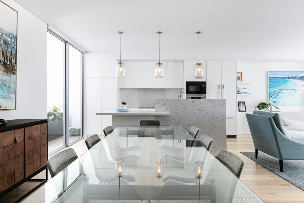
Here’s a recent project of mine showing minimal downlights or recessed lights usage . Actually there were only 2 lights near the Dining room and Kitchen given that I had specified enough ambient floor lamps and table lamps.

Minimal downlight usage at one of my past projects.. The pendant lighting was enough and a gorgeous lamp to the left that you cant see..

ANOTHER IMPORTANT TIP:

If you’re embarking on a renovation, PLEASE keep a short leash on your well meaning electrician? They’re trained to spread light to the world! So they will want to pepper your ceiling with copious amounts of downlights.. Don’t let them

Your fifth and final design crime , for now.. [ trust me there are thousands of them]

5. Rug Meanies .. They exist.

Using rugs that are too small for the room [ Its a criminal offence]

There is only one rule : Don’t use small rugs.

If you have a limited budget, go for a cotton or jute rug but….

MAKE SURE, SAID RUG IS BIGGER THAN THE FOOTPRINT OF THE SPACE YOUR DECORATING?

Yeah I know I’m shouting [ sorry, passionate.. ] but youre wasting money on a teeny tiny rug when you could wow yourself everyday by using a larger piece .

See an offence below..

Seeeeee? .. it looks mean and does nothing to support the rest of this lovely room.

Do not stop and go straight to Jail!
Meanwhile..on the outside ..

This is sooo purdy..

This is how you do it! Make sure that the rug is larger than the footprint of the furniture.. you’ll want be able to fit your sofa and a coffee table on the rug. The vibe is generous and beautiful.

So avid DIY’ers, with this timely information, you’ll hopefully never commit a design crime again!!

NEWSFLASH!

Im super excited to announce my new BUY NOW PAY LATER service!

So if you’d like to start your new project and need time paying you can now pay via BRIGHTE up to $60,000 over a 5 year period!

This includes

  • FEES
  • FURNITURE
  • LIGHTING
  • Basically anything pertaining to my services!

Or for smaller services up to $1200 you can get almost instant access to this wonderful service via my website!

So now you can easily embark on your next project with complete confidence!

Do you need a hand?

If you’re considering a new project in 2021, no matter how small or large, and don’t know where to start ?

Lets chat about all of the stunning possibilities!

Book your free 15 minute Discovery Call, I’d love to chat to you!

Wall-less bathroom trend attracting buyers across Australia

This article first appeared on realestate.com.au.


You either love it or hate it — that’s the opinion many hold about a bathroom trend appearing in a growing number of Australian homes on the market.

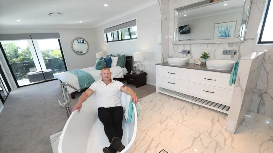
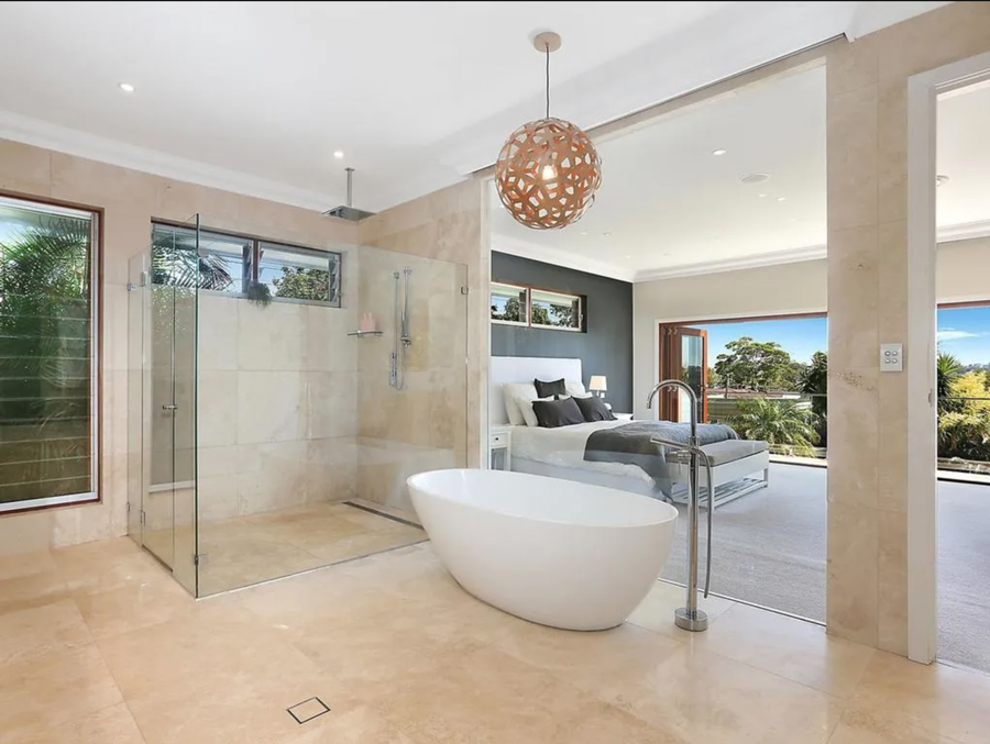
Real estate agents are seeing more homeowners put it all out in the open with their bathroom’s privacy or lack of. The trend has seen many ensuites on the market have no walls or a glass one to separate it from the main bedroom.

While the idea of seeing your partner on the toilet might be a turn off for some, for others, the perks more than make up for it.

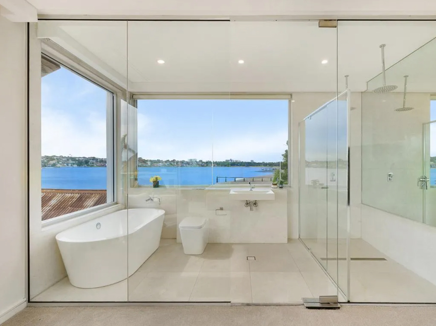
The ensuite at 69 Tara Street, Sylvania, has a glass wall and views of the Georges River.

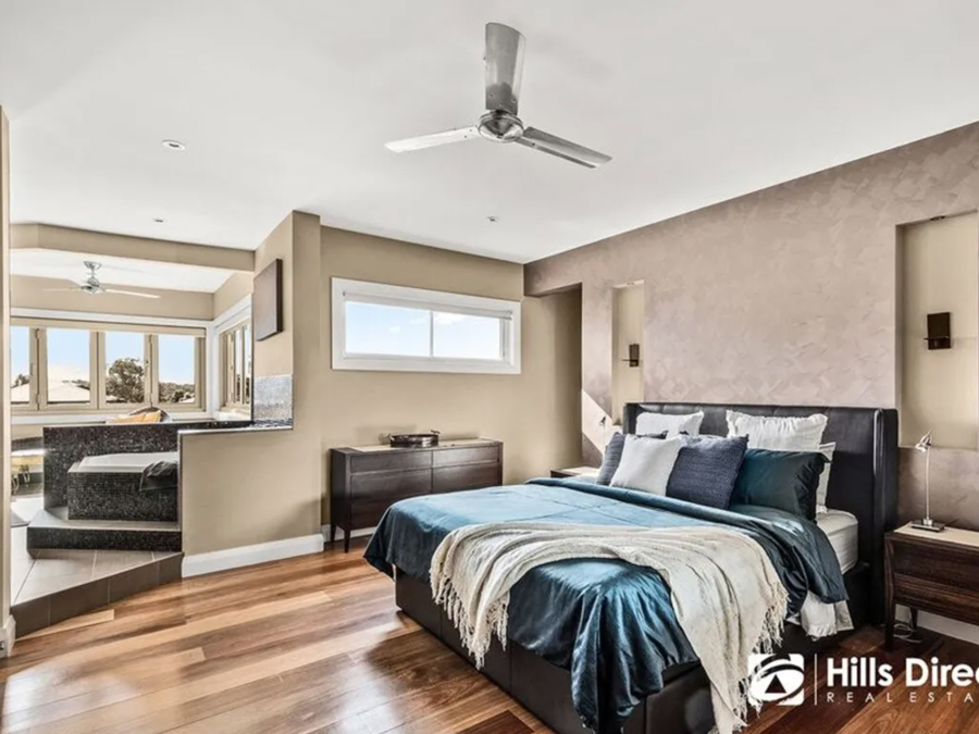
McGrath Sutherland Shire agent David Greig has one such property on the market at the moment in Sylvania. The bathroom has a glass wall that captures views of the Georges River across the bedroom. In turn, the bedroom can view the spa and the whole bathroom when privacy curtains are raised.

Mr Greig said he didn’t think most couples would mind having a bathroom with a lack of privacy when they can capitalise on stunning views.

“We normally see bathrooms like this where there is a gorgeous view on offer.” he said.

The trend can be traced back to hotels that offer bathrooms with minimal privacy. In Sydney, The Fullerton, Hilton Sydney and The Star Grand Hotel all have suites where the bathroom is integrated into the bedroom.

On the market last year, 147 The Promenade, San Souci, was all in the open.


No. 1 Lachlan Court claimed the Kellyville Ridge suburb record in 2020, despite having an open ensuite.


Interior designer Jane Thomson said the look had been around for a number of years and was popular with people looking to bring the holidays home with them.

Initially for the concept at first, Ms Thomson said she is not a fan of the open ensuite now due to a number of pitfalls about privacy.

“We all need a little mystery in our relationship instead of having it all in the open,” she said.

“This is especially the case when it comes to what we do in the bathroom.”

Ms Thomson, who has appeared on Changing Rooms, said if the idea resonated, she encouraged homeowners to spend a reasonable amount of time and money planning the space.

“You have to really work out how the space will be presented and you’ve got to have a focal point that is beautiful and wow,” she said.

“If you want to have glass windows, make sure you have good ventilation to avoid mould and install curtains so that you can have a private space if need be.”

It is not just luxury homes such as this Sans Souci house with a glass cube bathroom that have opted to do away with privacy. A Surry Hills rental made headlines after the studio raised a few eyebrows due its glass bathroom’s position next to the kitchen.